14 Build a plot layer by layer
14.1 Exercises
1. The first two arguments to ggplot are data and mapping. The first
two arguments to all layer functions are mapping and data. Why does the
order of the arguments differ? (Hint: think about what you set most commonly.)
- Commonly, you first set the data in
ggplot()and then set aesthetics inside your layer functions, likegeom_point(),geom_boxplot(), orgeom_histogram().
2.
mpg %>%
  ggplot(aes(class, hwy)) +
  geom_jitter(width = 0.15, height = 0.35) +
  geom_point(data = class, aes(class, hwy),
             color = "red",
             size = 6) +
  geom_text(data = class, aes(y = 10, x = class, label = paste0("n = ", n)))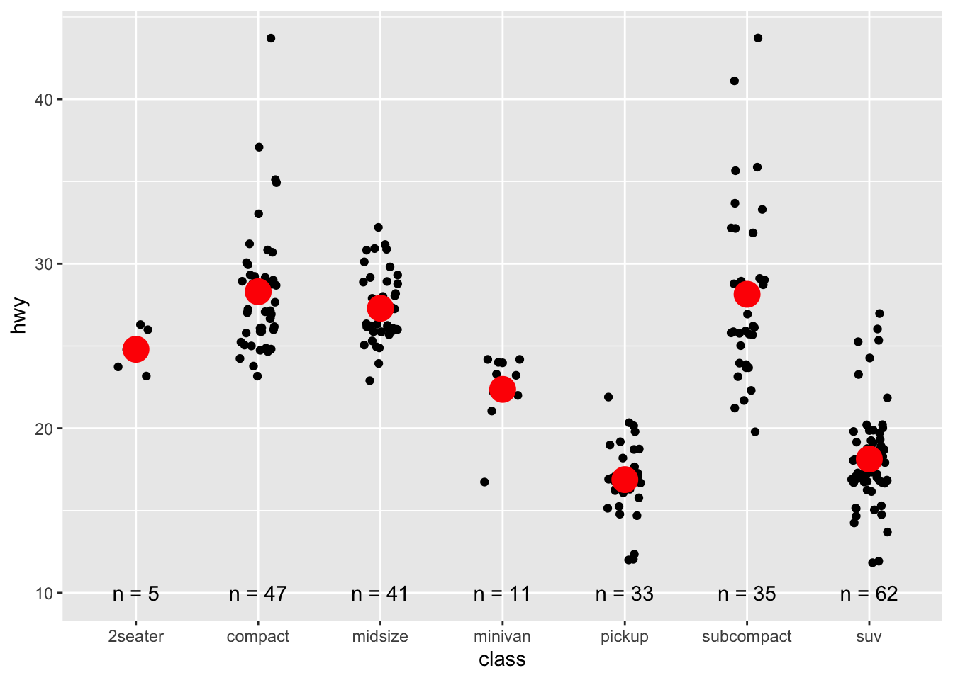
- I plotted 3 different layers: jittered points, red point for the summary measure, mean, and text for the sample size (n).
14.2 Exercises
1. Simplify the following plot specifications:
####################################
####################################
# ggplot(mpg) +
#   geom_point(aes(mpg$displ, mpg$hwy))

# The above can be simplified:
# ggplot(mpg) +
#   geom_point(aes(displ, hwy))
####################################
####################################


####################################
####################################
# ggplot() +
#  geom_point(mapping = aes(y = hwy, x = cty),
#             data = mpg) +
#  geom_smooth(data = mpg,
#              mapping = aes(cty, hwy))

# The above can be simplified:
# ggplot(mpg, aes(cty, hwy)) +
#  geom_point() +
#  geom_smooth()
####################################
####################################


####################################
####################################
# ggplot(diamonds, aes(carat, price)) +
#   geom_point(aes(log(brainwt), log(bodywt)),
#              data = msleep)

# The above can be simplified:
# msleep_processed <- msleep %>%
#   mutate(brainwt_log = log(brainwt),
#          bodywt_log = log(bodywt))

# ggplot(diamonds, aes(carat, price)) +
#   geom_point(aes(brainwt_log, bodywt_log),
#              data = msleep_processed)
####################################
####################################
2. What does the following code do? Does it work? Does it make sense? Why/why not?
ggplot(mpg) +
  geom_point(aes(class, cty)) +
  geom_boxplot(aes(trans, hwy))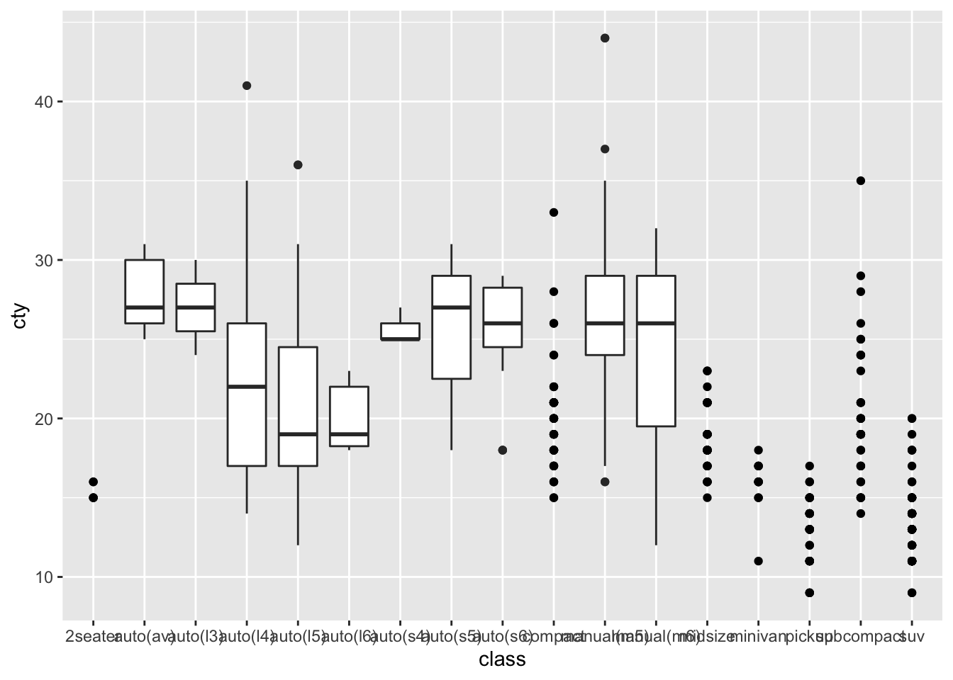
- It plots points of
classvsctyand then a boxplot oftransvshwy. It doesn’t make sense to plot layers with differentxandyvariables.
3. What happens if you try to use a continuous variable on the x axis in one layer, and a categorical variable in another layer? What happens if you do it in the opposite order?
- Not sure
14.3 Exercises
1,2,3 omitted.
- Starting from top left, clockwise direction:
-
geom_violin(),geom_point(),geom_point(),geom_path(),geom_area(),geom_hex().
14.4 Exercises
1.
mod <- loess(hwy ~ displ, data = mpg)
smoothed <- data.frame(displ = seq(1.6, 7, length = 50))
pred <- predict(mod, newdata = smoothed, se = TRUE)
smoothed$hwy <- pred$fit
smoothed$hwy_lwr <- pred$fit - 1.96 * pred$se.fit
smoothed$hwy_upr <- pred$fit + 1.96 * pred$se.fit

smoothed %>%
  ggplot(aes(displ, hwy)) +
  geom_line(color = "dodgerblue1") +
  geom_ribbon(aes(ymin = hwy_lwr,
                  ymax = hwy_upr),
              alpha = 0.4)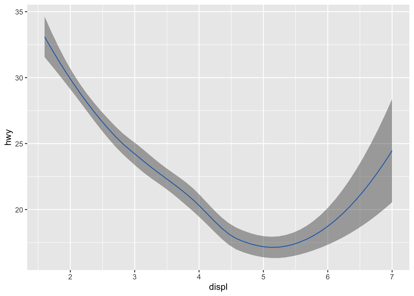
2. From left to right,
stat_ecdf(), stat_qq(), stat_function()
3.
mpg %>%
  ggplot(aes(drv, trans)) +
geom_count(aes(size = after_stat(prop), group = 1)) 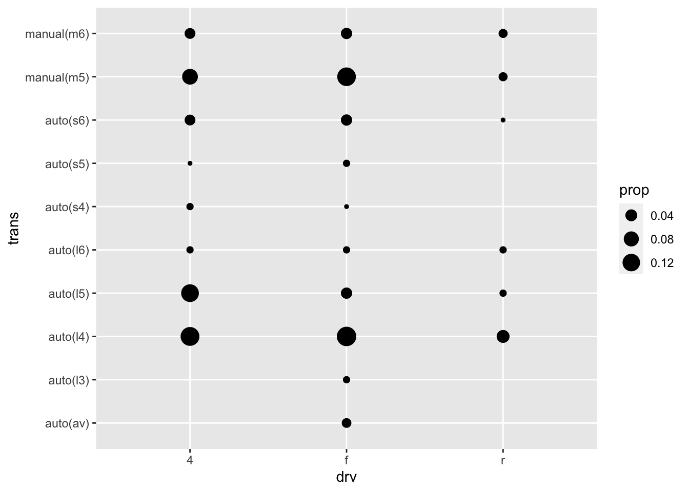
14.5 Exercises
1. According to the help page, position_nudge() is generally useful for adjusting the position of items on discrete scales by a small amount. Nudging is built in to geom_text() because it’s so useful for moving labels a small distance from what they’re labelling.
2. Not sure
3. geom_jitter() adds a small amount of random variation to the location of each point. It is useful for looking at all the overplotted points. On the other hand, geom_count() counts the number of overlapping observations at each location. It is useful for understanding the number of points in a location.
4. Stacked area plot seems useful when you want to portray an area whereas a line plot seems useful when you just need a line.