5 Statistical Summaries
5.1 Exercises
1. What binwidth tells you the most interesting story about the distribution of carat?
diamonds %>%
  ggplot(aes(carat)) +
  geom_histogram(binwidth = 0.2)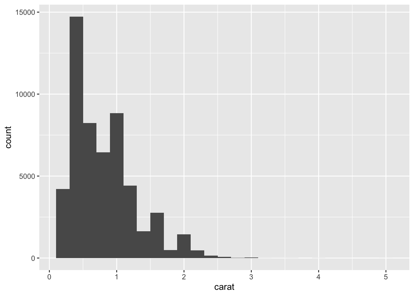
- Highly subjective answer, but I would go with 0.2 since it gives you the right amount of information about the distribution of
carat: right-skewed.
2. Draw a histogram of price. What interesting patterns do you see?
diamonds %>%
  ggplot(aes(price)) +
  geom_histogram(binwidth = 500)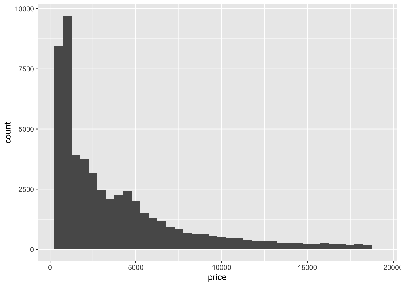
- It’s skewed to the right and has a long tail. Also, there is a small peak around 5000 and a huge peak around 0.
3. How does the distribution of price vary with clarity?
diamonds %>%
  ggplot(aes(clarity, price)) +
  geom_boxplot()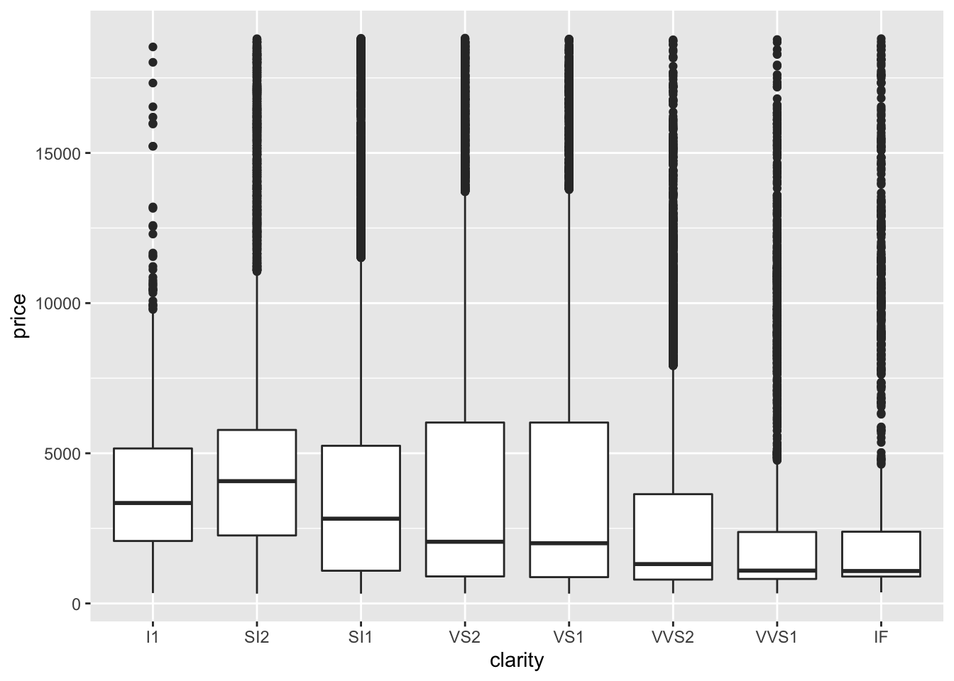
- The range of prices is similar across clarity and the median and IQR vary greatly with clarity.
4. Overlay a frequency polygon and density plot of depth. What computed variable do you need to map to y to make the two plots comparable? (You can either modify geom_freqpoly() or geom_density().)
diamonds %>%
  count(depth) %>%
  mutate(sum = sum(n),
         density = n / sum) %>%
  ggplot(aes(depth, density)) +
  geom_line()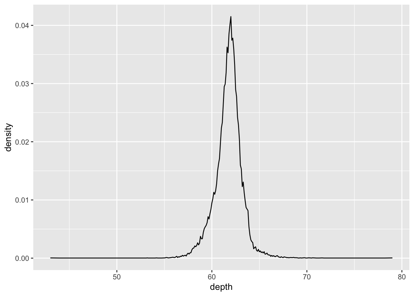
- Say you start off with the count of values in
depthand you plotgeom_freqpoly(). Then, you would want to divide each count by the total number of points to get density. This would get you the y variable needed forgeom_density()